REDESIGNING EVEREST EFFECT

PREPARE. RELIEF. RECOVERY.

Crisis can come in many different forms.

A natural disaster. A global pandemic.

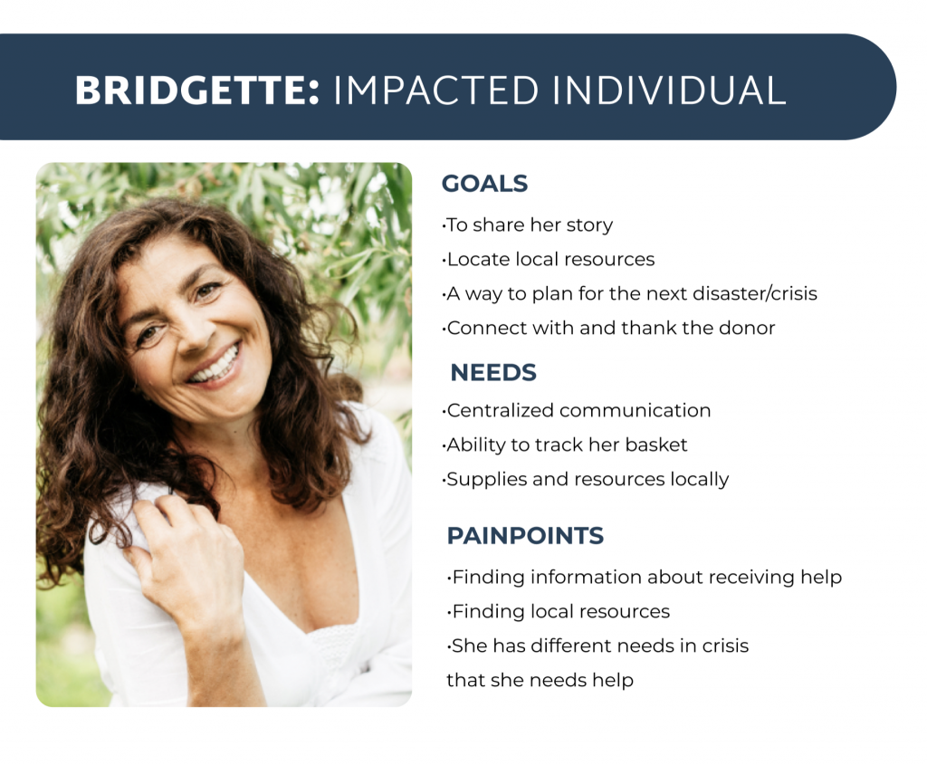
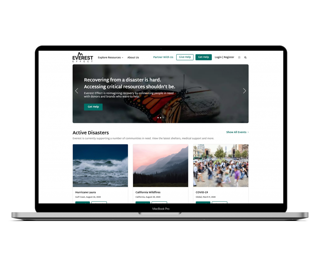
When a person experiences a crisis they need help but the question is where can they get that help?

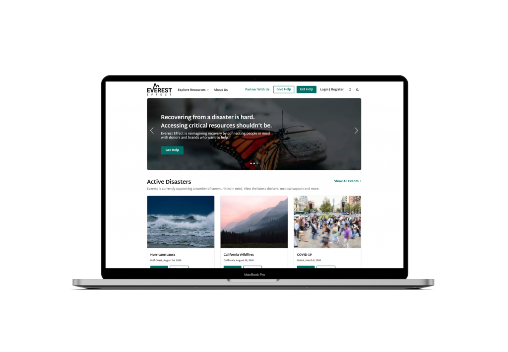
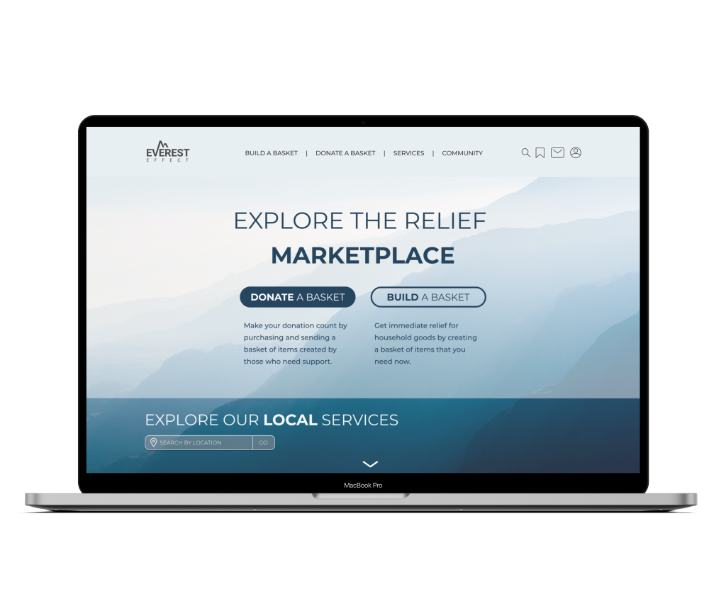
Everest Effect is a platform that helps rebuild the lives of those going through a crisis. Their goal is to help in a sustainable, impactful, and transparent way. Their platform provides a way for impacted individuals to request items that they need and donors have the ability to sponsor those items.

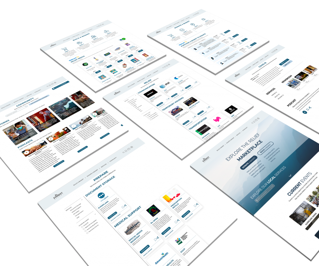
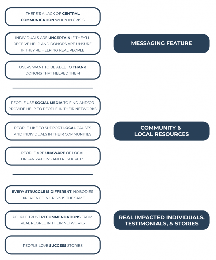
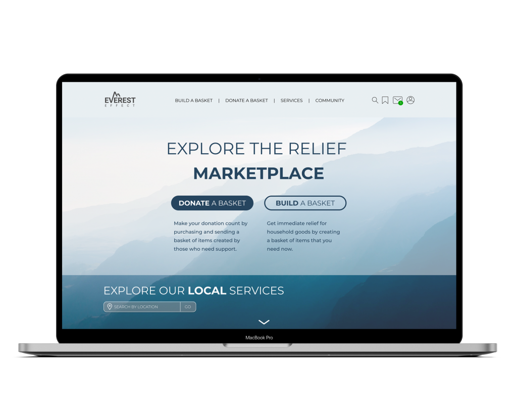
Our goal was to improve the users experience so that they can access what they need at their time of need. We began by researching to learn more about Everest Effect as a business and their users. While researching we gathered information about the users and their experiences when in need or when they donate. After business and user research we synthesized the data that we learnt and we started to design based on our research. With our redesign we created a prototype to show the functionality of the website.

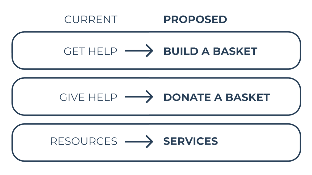
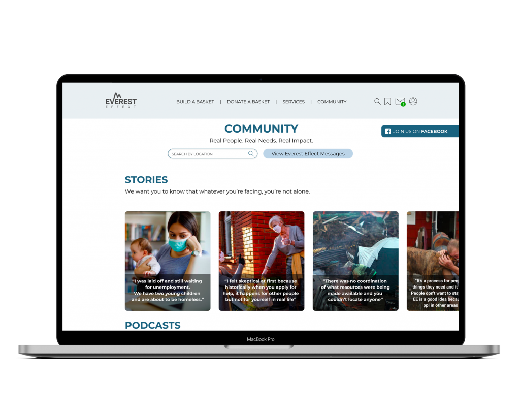
We ultimately worked with Everest Effect to restructure their Information Architecture, incorporate crowd sourcing, and create a local impact. Through working on the information architecture we were able to improve the users ability to navigate through the website and access what they need. We addressed the users needs, that we understood from research, by incorporating crowd sourcing and local impact into the Everest Effect redesign.

FOCUSING ON THE USERS

Our users were impacted individuals who need help in times of need and donors who want to help those individuals.
Keeping our users in mind every step of the way helped us establish a redesign for Everest Effect that includes a restructuring of the information architecture as well as adding features to the site for the benefit of the users.

Throughout the process we kept in mind:

HOW MIGHT WE PROVIDE A WAY FOR THE USERS OF EVEREST EFFECT TO FEEL PERSONALLY SUPPORTED AND ENGAGED WITHIN THE EVEREST EFFECT COMMUNITY?

EVALUATING THE CURRENT WEBSITE

Our goal when evaluating the current site was to understand how users navigate and understand the current navigation and structure of the site. In order to learn more about the usability of the site we completed a heuristic evaluation. To understand how users direct through the site we conducted tree testing and card sorting.

We were able to validate the credibility and value of Everest Effect. However other aspects of the site made it harder for users to navigate. We found that the websites overall structure isn’t clear and communicative to our users and therefore users don’t have a completely positive experience. With this understanding in mind we wanted to continue to learn more about our users current experiences, needs, and goals.

GETTING TO KNOW OUR USERS

To learn more about our users we interviewed donors and impacted individuals who were impacted by crisis. From interviewing these individuals we gained insight into the experiences of our users. We learnt about their experiences, goals, and needs when seeking or providing help. The following quote was said by an individual that we interviewed.

“when you feel a connection to a cause it’s more impactful”

What I learnt from this quote was the need to help users connect to Everest Effect as a organization and through the causes they provide on their website. By feeling connected to an organization and their mission users will feel supported. And through providing users with causes they connect to they’ll have a deeper impact.

We then met our persona, Bridgette. Bridgette is an impacted individual who previously went through Hurricane Harvey and currently lost her job due to Covid-19. Through meeting Bridgette we were able to emphasize with our users goals, needs, and frustrations.

We looked at Bridgette’s experience when building a basket with Everest Effect. Through Bridgette’s journey we learned more about her actions, emotional experience, pain points, and opportunities. She goes onto the Everest Effect website and she’s concerned that she might not actually receive the help she needs. She adds items that she needs to her basket and posts it to the site. Waiting for her basket to arrive can be frustrating because she has no way to track it. When it finally comes she’s so grateful and she wants to be able to thank her donor.

TRANSLATING INSIGHTS TO FEATURES

After learning more about our users we were able to align as a team and work together to decide what our redesign would include.
We looked at our insights from our interviews to understand what would improve our users experience.

A messaging feature is a place for users to communicate, provide assurance that they’re helping real people with real needs, and allow users to thank their donors.
By integrating a community page our users will have the ability to connect to the Everest Effect community and find local resource information.
Focusing on real impacted individuals, their testimonials, and stories will help users feel trust and connect to the mission of Everest Effect.

DESIGNING FOR OUR USERS

We took our website analysis and insights from our interviews and started with restructuring the navigation of the site. We worked on clarifying the current categories on the site. I really enjoyed this step of the process where we took everything we learnt from research and were able to make design decisions based on research.

While previously Everest Effect has been using categories such as Get Help and Give Help, we wanted to clarify to our users what getting help and giving help actually means. Based on research, users without a previous understanding of Everest Effect didn’t know the meaning of the features Get Help and Give Help. We clarified those titles into Build a Basket and Donate a Basket, with this transition users can come onto the site and understand what they can do to either provide or receive help. We also made the change from Resources to Services to clarify what Everest Effect is providing on that page

DESIGN INSPIRATION

The 3 stages of a disaster.
Prepare. Relief. Recovery.

During every stage there are different needs and resources required. We thought about how the 3 stages of a disaster correspond to climbing a mountain where there’s the incline, summit, and decline. Every part of getting over a mountain has different needs and requires different resources.

By incorporating a blue monochromatic color scheme we enhanced the feeling of reliability, integrity, and loyalty. Through our design decisions we wanted our users to connect to the design and the mission of Everest Effect.

To start designing we sketched a mid-fidelity design to visualize the redesign of Everest Effect and how to integrate the new features. With every round of design we edited and clarified Everest Effects mission.

After testing our mid-fidelity design we understood the importance of clarifying the goal of the site right on the home page. When working on our hi-fidelity designs we focused on the clarity of the home page so that users understand the goal of the website and what they can access.

To refocus on our home page we worked on emphasizing aspect of helping individuals get what they needs when in crisis. We also enhanced the usability of the navigation bar and the categories within it. We incorporated our title changes and easily understandable icons to improve the use of the navigation.

CURRENT HOME PAGE

REDESIGN

A design decision that I incorporated into the redesign was keeping the navigation bar fixed so that it’s always visible even when a user scrolls down the page. We did this in order to provide users with the ability to access the navigation at all times.

TESTING OUR DESIGN

After every round of design we conducted usability testing to test the functionality and usability of our site. From those results we were able to make design, navigation, and category title changes.
When testing we asked users to complete three tasks:

  • You have a message from the person who purchased your basket. Open message and reply.
  • You want to find out more information about how to prepare your pets for Covid-19.
  • You want to see local information within your community of Houston, TX.

The aspect of searching location information is a feature that we added to website based on our research. Therefore looking at the third task testing results was important to see if the use of the feature was understood by our users. There are two paths that a user could take to complete the third task:

1. Users can search for location information on the home page and then when they scroll down the page they’ll see local services near their location.
There is also a tab located on the top of the page that constantly shows the user the location that they searched and gives them the ability to change it.

2. When on the community page users can search by their location to access information relevant to their location.

We completed 3 rounds of testing and after each round we looked at the results and the users actions. We looked at easiness rating, average time on task, and the success rate of the users. Based on the results we were able to iterate on our design.

  • After our first round of testing we saw that all our users completed the tasks successfully however half the users took an indirect path.
  • Through round 1 of testing we saw that the location feature was placed in the navigation bar and it wasn’t intuitive for our users. Therefore going into our round 2 of design we improved it.
  • Round 2 of testing showed an improvement in results because we improved the search location feature and we  included the location search on the homepage.
  • However round 3 of testing showed a bit of a decline because of where the users were located on the site before the task began. Therefore one of our next steps would be to make the location search easily accessible on all pages of the site.

MOVING FORWARD

  • We would conduct another round of usability testing to improve the experience of the website.
  • Improve the visibility and usability of the search location feature.
  • Iterate on our design by incorporating additional insights we got from research.
  • We would also like to work on mobile screens for these designs.

CONCLUSION

We had the opportunity to work with Everest Effect as a team of UX designers to improve the user experience of their website. We were able to discover and define our users needs and goals through research. We were then able to make design decisions based on our research. Creating our redesign provided an improved user experience where users can connect and feel supported while fulfilling their needs through the Everest Effect platform.

In my role as lead designer working on the design of the home page was one of the most exciting parts of the project for me. Working on the home page set the look and feel for the Everest Effect platform as a whole. Being able to take our research and understand what would benefit our users really helped us design the overall look and feel of the website. With that we were able to design an intuitive experience for our users.

Click the image below to view the prototype 🙂